Overview
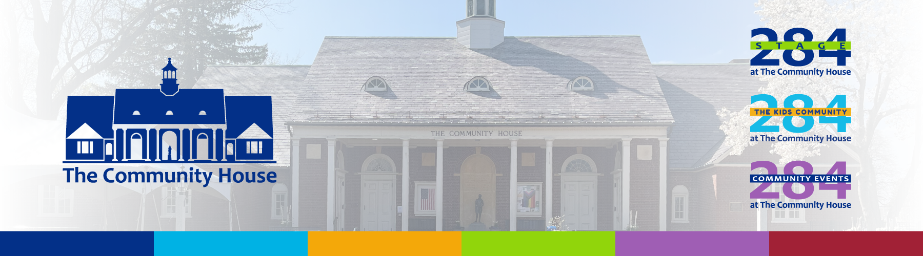
After working extensively with The Community House’s existing brand system, I identified opportunities to create a more flexible and cohesive visual system for the organization and its programs. I proposed a comprehensive brand refresh to the Marketing Committee, received approval to move forward, and led the development of the updated identity.
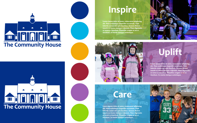
The project included a refreshed primary logo, expanded color and typography systems, updated program identities, and standards for consistent use across print and digital communications. The resulting system was documented in a comprehensive brand guide, with a condensed quick-reference guide created for everyday staff use.
Challenge
The existing identity presented several challenges when applied across the organization’s growing range of programs and communications. The primary logo relied on intricate architectural linework that could lose clarity at small sizes and proved difficult to reproduce consistently across different formats and production methods.
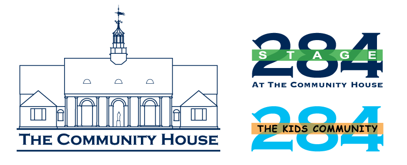
Program identities had also developed independently over time, resulting in inconsistent logo treatments and typography. Stage 284, for example, had multiple logo variations in active use, while The Kids Community identity relied on typography that no longer reflected the organization’s visual direction. The challenge was to create greater consistency and flexibility while preserving the recognizable elements and individual personalities of the established brands.
Challenge
The existing identity presented several challenges when applied across the organization’s growing range of programs and communications. The primary logo relied on intricate architectural linework that could lose clarity at small sizes and proved difficult to reproduce consistently across different formats and production methods.
Program identities had also developed independently over time, resulting in inconsistent logo treatments and typography. Stage 284, for example, had multiple logo variations in active use, while The Kids Community identity relied on typography that no longer reflected the organization’s visual direction. The challenge was to create greater consistency and flexibility while preserving the recognizable elements and individual personalities of the established brands.
Approach & Development
As chair of the Marketing Committee, I worked collaboratively with committee members to evaluate the existing identity and establish priorities for the refresh. The goal was to preserve recognizable elements of the brand while creating a more cohesive, approachable, and practical system for everyday use.
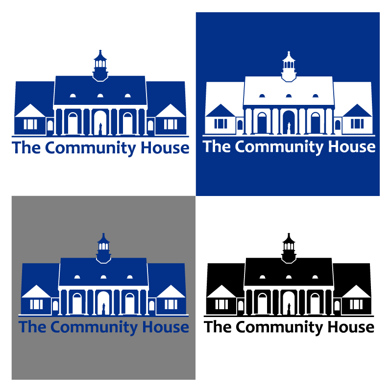
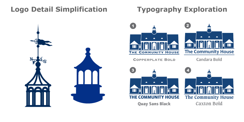
The detailed architectural linework was simplified into stronger solid forms for greater clarity and versatility across applications. I explored new typography to give the identity a warmer, more welcoming personality, while establishing consistent treatments for the organization’s program identities. These decisions created a clearer relationship between the parent brand and its programs without eliminating their individual character.
Approach & Development
As chair of the Marketing Committee, I worked collaboratively with committee members to evaluate the existing identity and establish priorities for the refresh. The goal was to preserve recognizable elements of the brand while creating a more cohesive, approachable, and practical system for everyday use.
The detailed architectural linework was simplified into stronger solid forms for greater clarity and versatility across applications. I explored new typography to give the identity a warmer, more welcoming personality, while establishing consistent treatments for the organization’s program identities. These decisions created a clearer relationship between the parent brand and its programs without eliminating their individual character.
Solution & Outcome
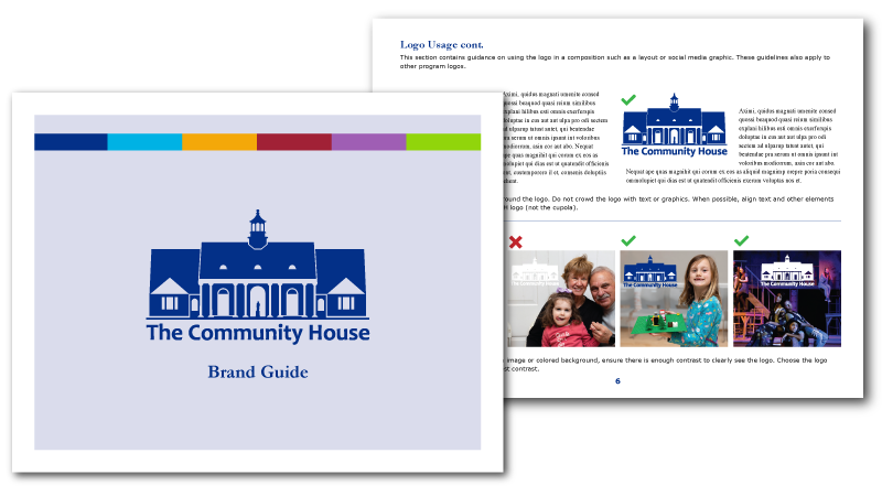
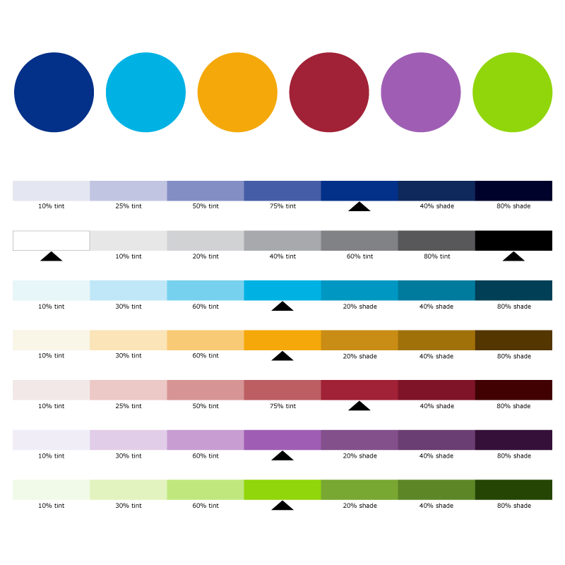
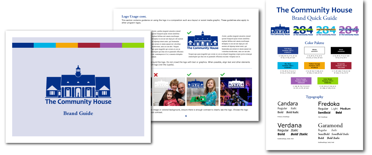
The completed refresh established a comprehensive brand system encompassing the primary identity, program brands, color and typography standards, logo usage, event branding, co-branding, photography, and other guidelines for consistent application across the organization.
I documented the system in a 20-page brand guide and created a condensed quick-reference guide to make the standards accessible for everyday staff use. The updated identity and supporting system were presented to The Community House Board of Directors, providing the organization with a cohesive and practical framework for future communications.
Associated marks, copy, and images property of The Community House.